

These are some of the menu designs I created for the Criterion Collection edition of Harold Lloyd's Safety Last! I don't think you can help but ask during the movie's building climbing, clock dangling climax, "is that for real?". The answer to the question is more surprising and nuanced than one might expect. Even the film's plot even gets pretty meta on the subject. What's not revealed in the story is amply and rewardingly so in the generous supplements for the release. For the DVD menus as well as the packaging I looked to inject some reality tweaking into the design by building the type into the shots.
Blow Out
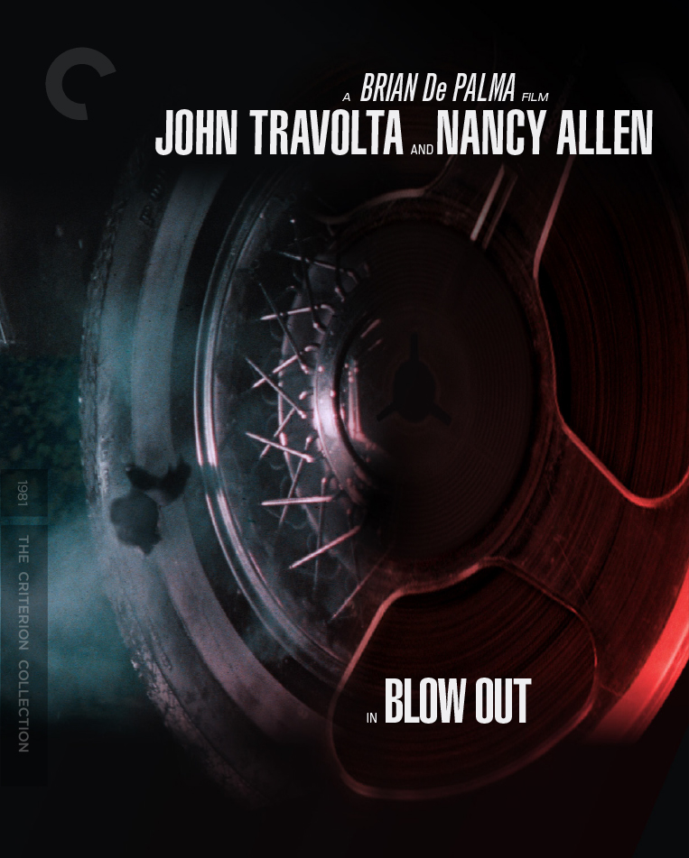
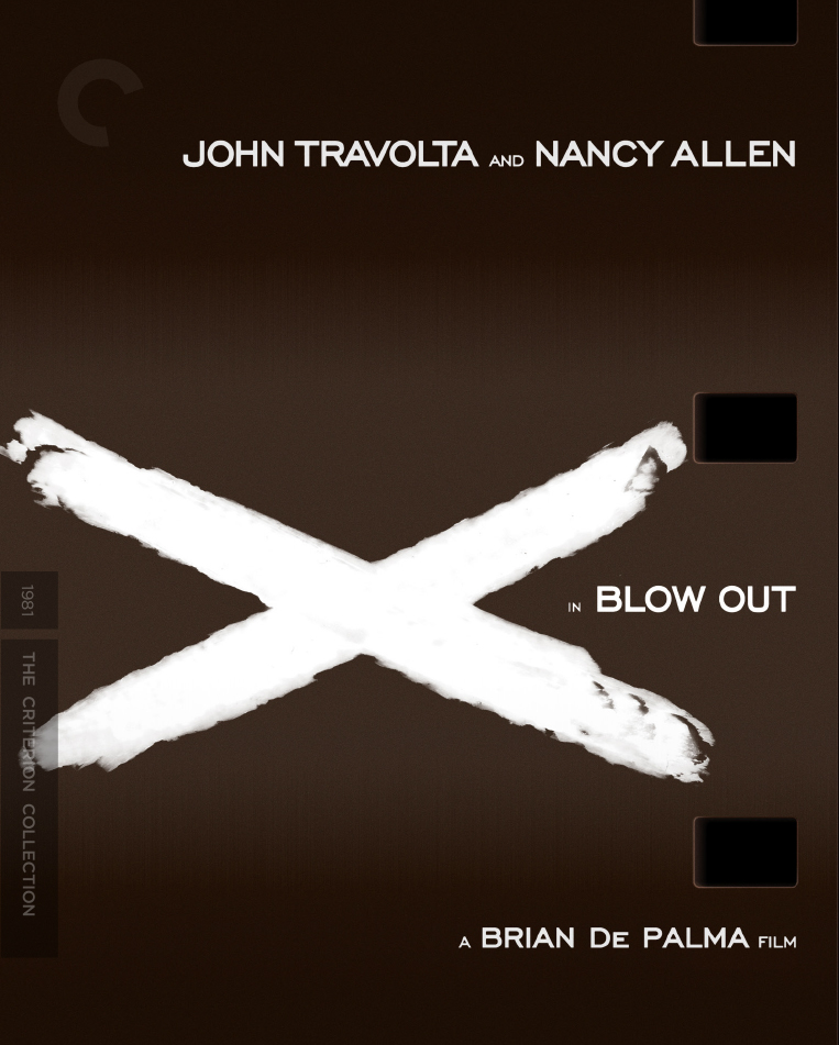
Here are a couple of unused cover concepts for The Criterion Collection edition of Brian De Palma's Blow Out. The brief at the time was to bring the technology of the story somehow on to the cover design. John Travolta plays a movie soundman who's an ear-witness to a murder. His tools of the trade are a microphone and a reel-to-reel recorder. There's a terrific shot of the tire going pop and it seemed a natural to me to fuse it with an image of a tape reel. When the Travolta character retreats to his sound studio to piece together the crime he attempts to synchronize it with a moving image --thus the perforated audio tape with the X that marks the spot.

Safety Last!
Coming to a theater near you! My poster design for the Janus Films release of the great Harold Lloyd's Safety Last! Not coincidentally based on my cover artwork for The Criterion Collection's release (in June) of the very same. It's a PACKED disc lots of fun and illumninating extras, plus some Llyod shorts which I believe have never before been available for home video. It's a good one.
The Gold Rush
A while back The Criterion Collection asked me to contribute some title treatment designs for their release of Charlie Chaplin'sThe Gold Rush. I had a lot of fun coming up with a bunch, inspired by woodtype posters of the great California gold rush of 1849. The creative direction changed a bit and none were used. It happens. This title treatment solution was a particular favorite.


The Man Who Knew Too Much
The American Institute of Graphic Arts --posted a behind-the-scenes article about The Criterion Collection, detailing the creative process for The Man Who Knew Too Much . It's a terrific glimpse of the Criterion process from initial editiorial deliberations, on to the conception and completion of a cover. It's an honor to be included. Check it out!
• The Man Who Knew Too Much: In House Design at The Criterion Collection