

I’m pleased to share my poster design for a documentary making it’s debut at the 2019 Sundance Film Festival, “David Crosby Remember My Name”. I really enjoyed working with the folks at PCH and Vinyl Films, they’re great collaborators. The material for the documentary is rich and it runs deep, so we weren’t lacking for something interesting to say or show for a poster —and the desire was there too. As we wrapped up our initial meeting it the director, A.J. Eaton’s parting note was ‘go bold!’. I think the image by photographer Henry Diltz meets the criteria. Special thanks to David Crosby, director A.J. Eaton and producers Cameron Crowe, Michele Farinola and Greg Mariotti.
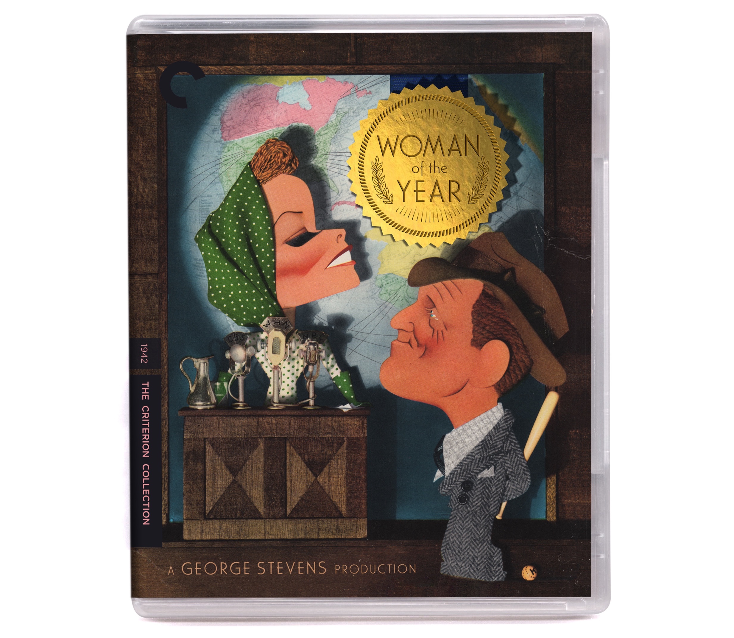
Woman of the Year

A designer likes to be noticed. Its gratifying to do work that calls attention to yourself. Its one of the ways that we get more work —often more of the kind of work we want to get. I'm that way. I'm also the kind of designer that feels like the solution should come from the problem —and when you've been handed a piece of (vintage!) artwork by the great Jacques Kaperlik, try not to step all over the thing. That's where I found myself when asked to design for the Criterion Collection edition of George Steven's "Woman of the Year" (1942).
I'm not entirely sure of the original context of Mr. Kaperlik's wonderful illustration, whether it was for a magazine promotion or an unused piece of studio publicity but he thoughtfully left a generous bit of space in the upper right for a title treatment to live. All I knew is that I wanted to be as unobtrusive as possible and --whatever I made-- that it looked like it belonged. Ideally, it would look as if it had always been there.
Woman of the Year is itself of course, an award so a blue-ribbon medallion of sorts seemed like a natural. I played with a bunch of different shapes and one that radiated like a bright sun, which gave the composition added warmth, won the day. The fun/tricky part was selecting typefaces which suggested golden-age early 40s Hollywood and making the medal appear as if Mr. Kaperlik had something to do with it.
At the time I was solving for the cover image though it wasn't long after that it became apparent that the medallion and ribbon motif presented abundant visual opportunities throughout the package. So as it turns out, even when one designs to be unobtrusive and in the service of an illustration there are still opportunities to show off. Presented here along with the cover is the package interior, samples from the insert as well as samples of the DVD menus.


The Princess Bride
Once upon a time, a designer asks —or it is asked of them— "What's the typeface used for The Princess Bride?" The designer invariaby replies, "I don't know offhand but I recognize it. I know that I've seen it before. I'll look into it and get back to you."
Hours of careful research —or is it days?— yields the same answer every time: there is no such typeface. What you believed to be a commonplace, off the shelf solution (or perhaps a sligthly modified one) wasn't that at all. How does something which presents itself as wholly familiar prove to be utterly non-existent? Beats me. Some questions in life are like that.
So what does a designer do then? Be a designer of course and make one. Which is what I did when Mr. Eric Skillman asked the age-old question of me in regard to the Criterion Collection edition of The Princes Bride. The delightful, storybook edition is available now.

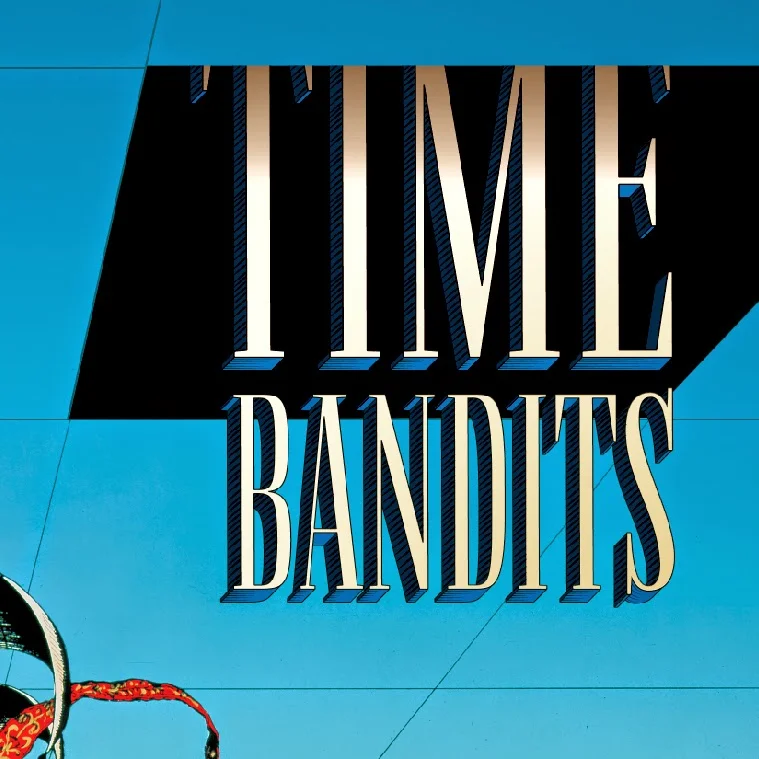
Time Bandits
After a long spell listed as "out of print" The Criterion Collection has reissued Terry Gilliam's Time Bandits in swell new Blue Ray and DVD editions. Art Director Eric Skillman tasked me to come up with a new title treatment for the occasion. If you haven’t seen it, Time Bandits is, in part, about time travel via black rectangular portals. Having the title descending through one of the these openings seemed like a natural. Thankfully it was embraced by all. The next step was rendering something that would go well with the vibe of the original theatrical poster artwork. (you can click on the detail art for an even closer view) The disc will be out in December. It stuffs a good stocking.

A Hard Day's Night
On June 24th The Criterion Collection released A Hard Day's Night in a most spectacular and comprehensive edition. There were many hands on deck for this one and I was one of the designers asked to contribute some cover concepts. Ultimately Criterion went with a solution by the estimable Rodrigo Corral but for a while these were a contender. At the time we hadn't settled on a color solution. There were dozens. Here's four. One for each Beatle.
