
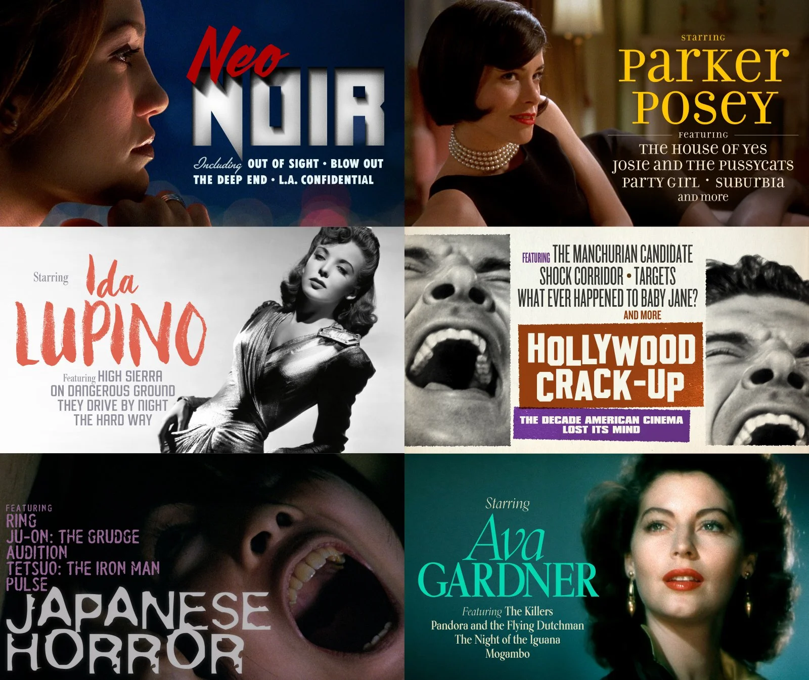
There’s a newly added gallery on the site dedicated to graphics I’ve designed over time for The Criterion Channel. The Channel graphics are like vertical format movie posters of a kind. Instead of promoting any one movie these designs represent the curated collections appearing on The Channel. They’re also known to turn up in the wild of social media as promotional items.
New collections are regularly introduced on the first. Some stick around indefinitely, others are around for just a month or three. The design of a collection happens during a brief two week window at the beginning of the preceding month, so you have to be nimble. Typically I’m creating four of five of these at once. All in collarboration with Art Director, Sarah Habibi.
Collections are always premised on a theme. It can be as straightforward as “Starring Veronica Lake”. Sometimes it’s a little more nuanced like “60s Hitchcock”. Or maybe a LOT more nuanced like “Hollywood Crack-Up, The Decade That American Cinema Lost Its Mind”. Either way the challenge is the same: visually communicate the concept of the collection in a manner in keeping with the subject.
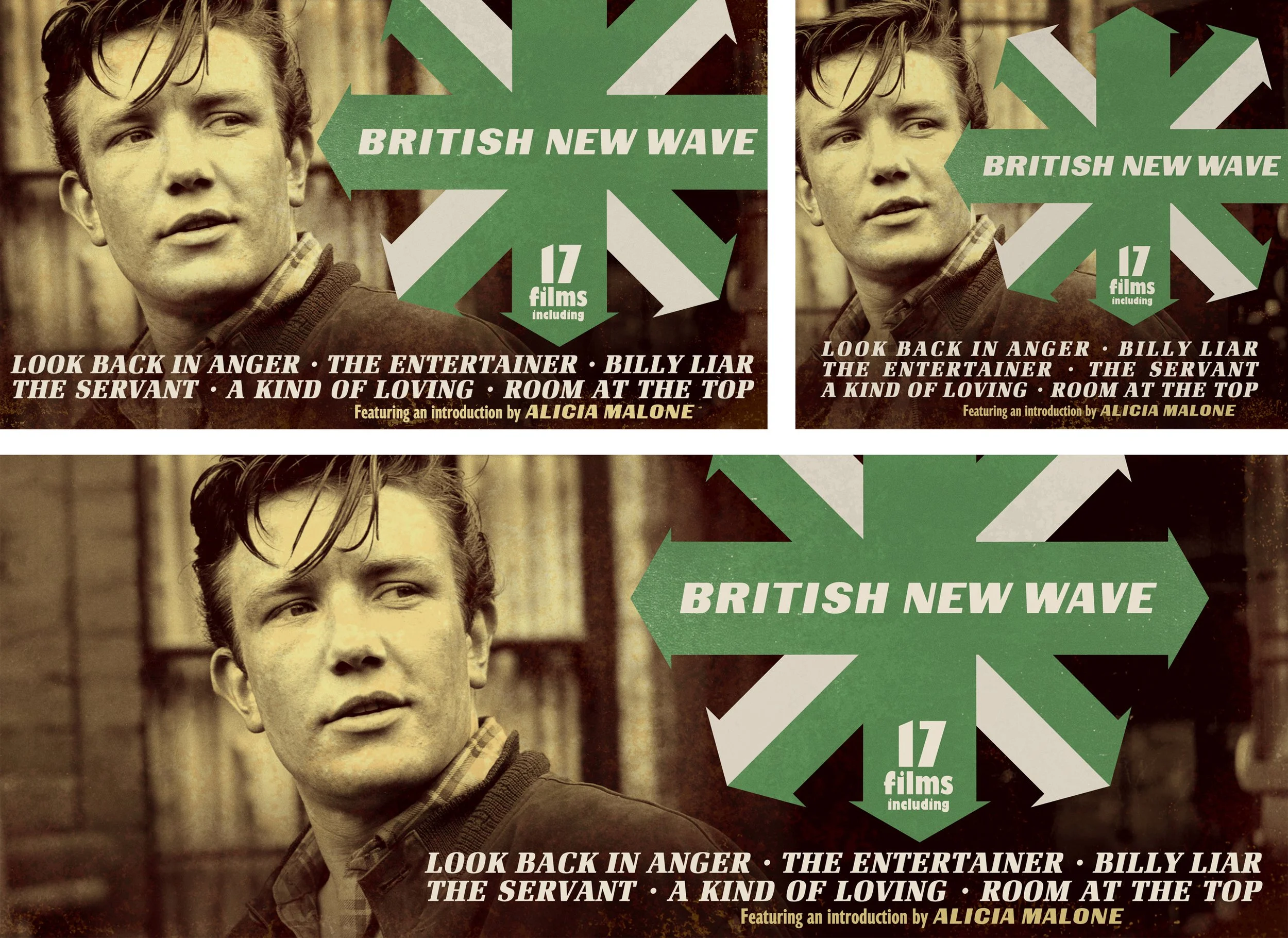
The hero design is created in the ubiquitous 16:9 aspect ratio. Once approved two more iterations are set up: a square version that displays on the mobile platform and a super-widescreen version for the streaming platform. It can be an added layer of trickiness when designing the hero knowing how much more image (or less!) might be necessary to make those proportions work.
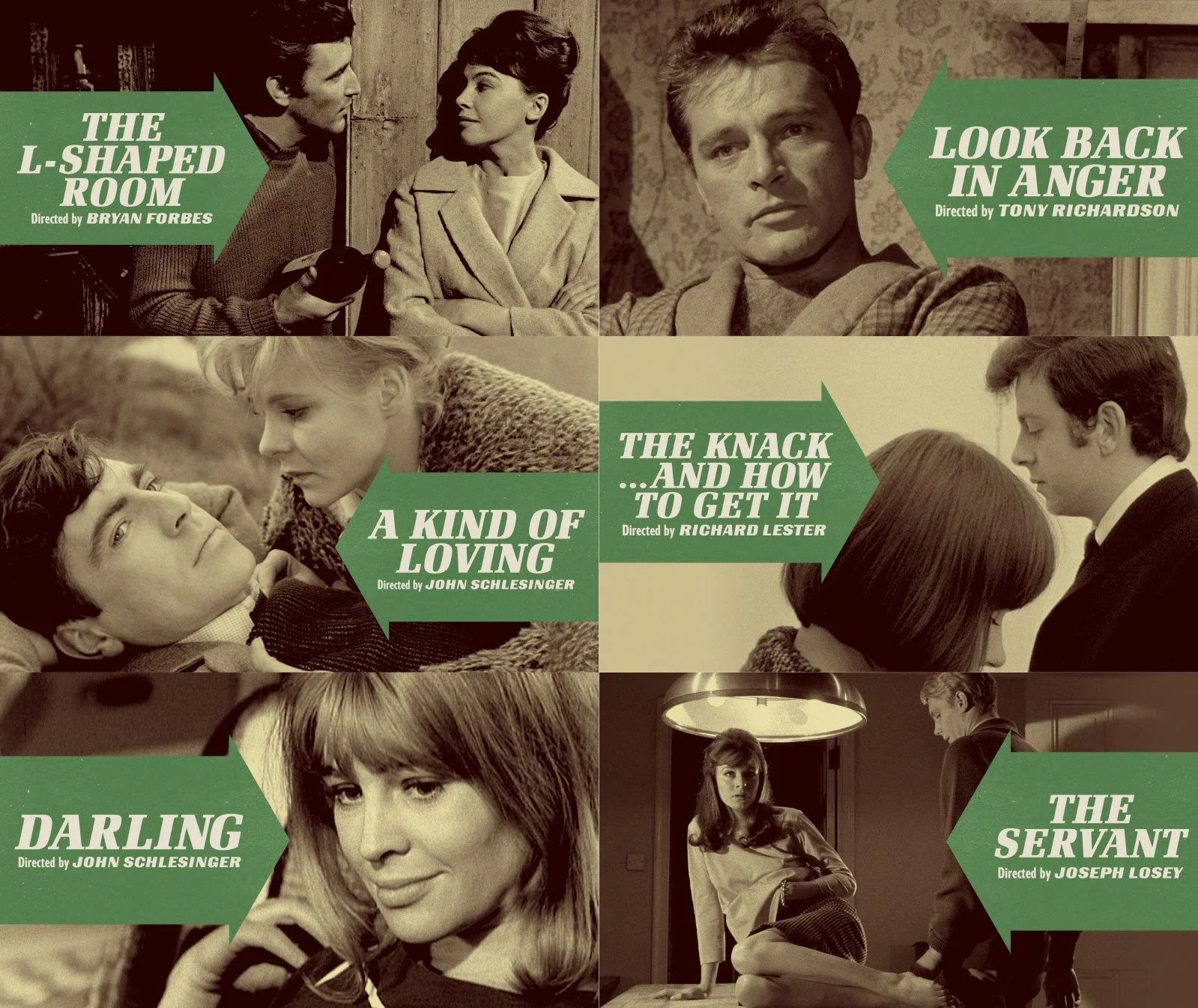
The Channel has graphics for the individual titles too of course. Whenever possible I like to visually tie them to the collection which they belong. There’s always a ton of movies to choose from on the Channel at any given time and having the visual cue that a title is part of a colletion helps when you’re browsing. Plus, it’s a nice reference Criterion Collection proper and the way one experiences a design through-line with the boxed sets.