
Harold Lloyd’s back inThe Kid Brother; the fourth Criterion Collection edition featuring the comic great.
I’ve been fortunate to design each of these — partnered with the terrific Sarah Habibi, art director at Criterion— and it’s looking like the visual motif we established with the first outing, Safety Last!, is sticking. That is: take a character-defining image of Harold from the movie that also makes room for a treatment to exist realistically within the picture (as opposed to being superimposed over it).
Easy to say but you gotta have the image that lets you do it. Thus far we’ve had remarkably good luck in threading that needle, in no small part, due to the work of smart production photographers that knew great set-ups when they saw them. Many of Lloyd’s sight gags that can be —and often were— reduced to a still image. I suspect that this visual economy has, in part, worked to sustain his image over the years —and they’re still funny.
The Kid Brother isn’t a straight-up western but Harold plays a small town sheriff (of sorts) and it takes place in old California. (Location mavens: Glendale, California has never since looked so bucolic nor Catalina island quite as venturesome.) Those elements would be essential ingredients for the cover image and ideally I’d want to show both.

I pulled stills of what I considered to be the best cover candidates and made quickie, proof-of-concept designs demonstrating how each of might play. It seemed pretty obvious which was strongest of the lot and best described the movie. The runners-up were repurposed in the packaging and DVD menus. Waste not. Then, with an image we liked, I designed a series of title treatments to occupy that space on the floor of the porch.
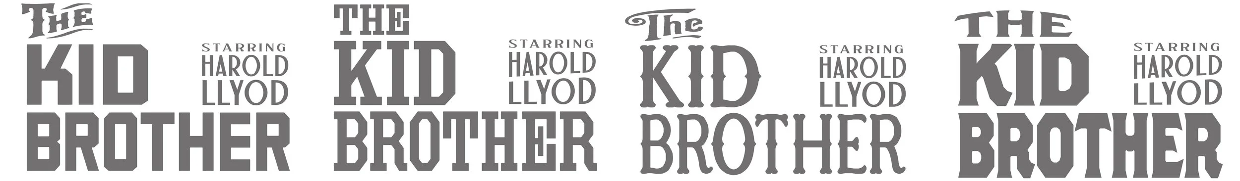
Wood type seemed to be the way to go here for it’s associations with the western genre plus a little something with deco allusions to tie it in with our hero. The treatments look a little awkward in this form. It’s not until they’re laid into the picture with Harold do they take on some life. The top-heaviness goes away as soon as its reduced by single point perspective. You may have noticed egregious mis-spelling of the star’s name in these work-ups! My occasional dyslexia at work again.
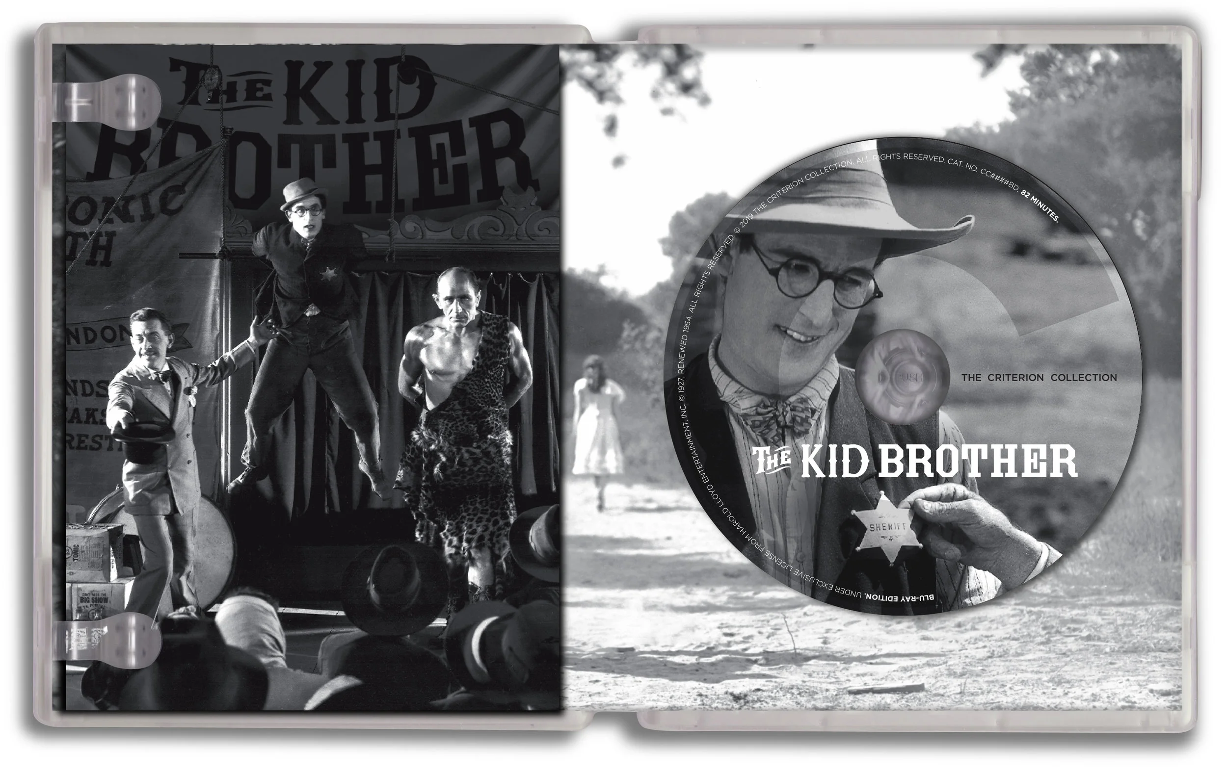
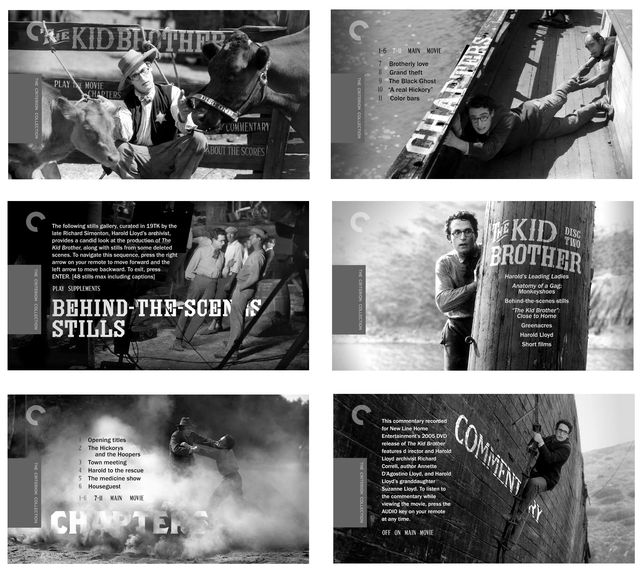
What follows are images of the package interior as well as samples of the DVD menus.