
A while back The Criterion Collection asked me to contribute some title treatment designs for their release of Charlie Chaplin'sThe Gold Rush. I had a lot of fun coming up with a bunch, inspired by woodtype posters of the great California gold rush of 1849. The creative direction changed a bit and none were used. It happens. This title treatment solution was a particular favorite.


The Man Who Knew Too Much
The American Institute of Graphic Arts --posted a behind-the-scenes article about The Criterion Collection, detailing the creative process for The Man Who Knew Too Much . It's a terrific glimpse of the Criterion process from initial editiorial deliberations, on to the conception and completion of a cover. It's an honor to be included. Check it out!
• The Man Who Knew Too Much: In House Design at The Criterion Collection
The Man Who Knew Too Much

Happy New Year already! Come January 2013 The Criterion Collection will release the original 1934 version of Alfred Hitchcock's The Man Who Knew Too Much. They kindly asked me to design the title treatment for the cover as well as the creating the menu and package design. I'm looking forward to showing off all that when the time comes so please stay tuned. As for the excellent cover illustration, it's by Bill Nelson --beautifully done, right?
Les Visiteurs du Soir DVD Menus
I also designed the sister release to Children of Paradise, Marcel Carné's Les Visiteurs du Soir. The setting for this one is mediaeval France. Toggling my design sensibilities between the two epochs made for one schizophrenic month! Again, the cover painting is by production designer Alexandre Trauner. The design choices here are largely informed by the illuminated manuscript which is featured in the title sequence of the film.


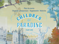
Children of Paradise DVD Menus
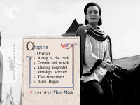
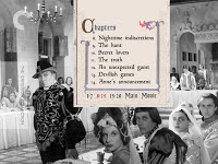
Here's a selection of DVD menu designs for The Criterion Collection's Children of Paradise. It's a two-part film spread over a two disc set (for the DVD at least) and it's packed with all kinds of extras which makes for a lot of screens. These are just a portion of them.
One of the challenges with this package was to interweave the whimsical sensibility of the Alexandre Trauner production painting which appears on the cover (as well as the theatrical re-release poster) with the film imagery. I stuck with type styles that were true of 19th century France and at the same time reflected of a certain 1940's aesthetic as well. The result is more storybook than history book which really seemed in accord with the movie.


One of the challenges with this package was to interweave the whimsical sensibility of the Alexandre Trauner production painting which appears on the cover (as well as the theatrical re-release poster) with the film imagery. I stuck with type styles that were true of 19th century France and at the same time reflected of a certain 1940's aesthetic as well. The result is more storybook than history book which really seemed in accord with the movie.