
I've had some fantastic design opportunities afforded to me by The Criterion Collection but nothing quite like America Lost and Found, The BBS Story -- a boxed set of seven quintessential (or is it septessential?) 70's films. I'm new to writing process posts and really, I'm not sure this even qualifies as one but here it is:
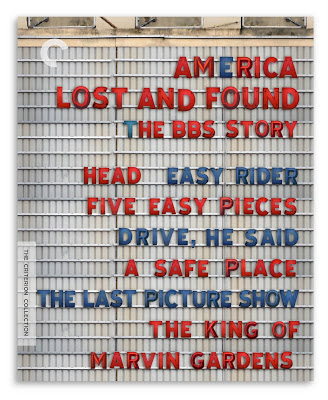 The Cover: I pitched two concepts, one of a battered American flag and the other of an old-style movie marquee. I thought the flag would prevail but Criterion really dug the run-down marquee. I'm glad they did. There's a lot of type on this cover and virtually all of it needed equal prominence. The marquee hit the right metaphoric note and it provided an organic solution to the problem of all those words.
It seemed a natural extension of the theater concept that the individual covers should be like movie posters. Though what kind of movie poster? I didn't want to do straight pastiche yet somehow they needed to be era appropriate. There's a kind of high-concept approach to graphic design that I associate with the late sixties/early seventies --the work of Bob Gill came to mind-- and I let that notion dictate my choices. Criterion liked the sound of this and approved the direction --it was suggested by Criterion president, Peter Becker that I consider placing the artwork inside a poster case. Great idea and as it turns out just the kind of bridging element that would tie the set together. Wish I'd thought of it!
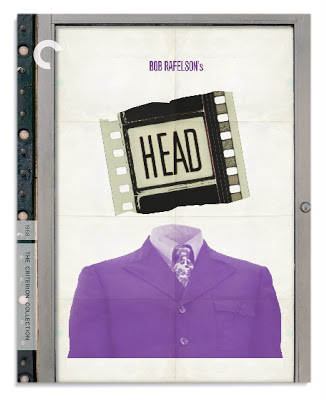 Head: Creating a pop confection that referenced the Monkees of TV didn't ring true to me. True, Head is a Monkees movie but it's hardly a movie version of the TV show and all that might imply. Head is something else and it seemed to me a Pop/Magritte collage could best convey that surreal else-ness. They say that Head has no opening titles. I suppose that's true but I wonder if you found the first reel and examined the leader you might discover differently?
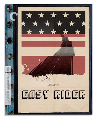 Easy Rider: I didn't work alone on this project, if not for the estimable talents of my colleagues Fred Davis and Peter Grant, making the deadline would have been impossible. I had about five days to do six covers. Not a great deal of time but I was feeling particularly inspired by the material. Ideas were coming fast. I was confident I could generate a cover a day --though not necessarily two. So on the Wednesday of that week, with two and a half covers done I called Mr. Davis. I showed him what I had made and asked him to contribute some Easy Rider concepts. He did. We had some back and forth and soon thereafter arrived at this piece of visual poetry.
 Five Easy Pieces: An idea that came fully formed in my head: lines of music fused with the classic method for counting to five (albeit turned on it's side). It seemed befitting of Jack Nicholson's character, Bobby Duprea: it's a little oblique, takes some figuring out and something about it feels self-negating. I was pleased to render a solution that referenced the piano prodigy/road picture aspect of the movie. For so long the primary image associated with this film has been Nicholson in a hard hat next to an oil well. Handsome sure, but how well did it really relate to the story?
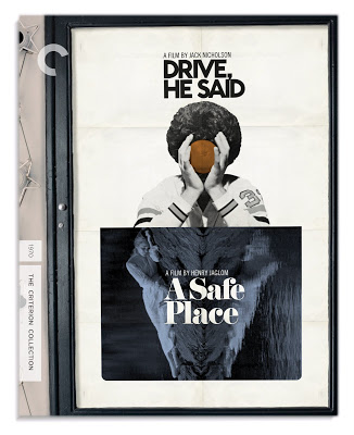 Drive, He Said / A Safe Place: It was learned some time into the process that there would be approval issues for any new image for Drive, He Said. There wasn't so much time for that so we went with an image which had been used during the film's general release. I played around with some Noah's ark imagery for A Safe Place but the universal reaction was that it read as too childish. Contemplating the Drive image, I was struck by the symmetry and that led me to the idea of turning the Tuesday Weld shot on it's side. Combined, the two have a Rorschach quality which may befit A Safe Place more so than Drive, He Said but since Drive is in the lead position I think on balance it works.
 The Last Picture Show: Another image that came fully formed in my head. The ticket corresponds to the film's title while the tear underscores the destruction of what was once whole --innocence perhaps? People like to keep tickets as souvenirs and in this sense the image too, speaks of memory and things from the past. Like the film, the cover is made in black and white.
 The King Of Marvin Gardens: My original version of this used the silver top hat, Monopoly token as the image within the title deed card. It seemed like an amusing metaphor for how the main characters saw themselves. Some at Criterion agreed and some didn't. Further, director Bob Rafelson wanted to see some Atlantic City imagery on the cover. So the hat was scrapped. I merged this shot of the two leads on horseback with another shot of the boardwalk as seen from the beach. In the end it worked out for the better. I'm very fond of the ticket image for The Last Picture Show and to have two covers in this set premised on objects-as-metaphors would have diminished the impact of each--especially when side-by-side in the collection.
As I mentioned, I didn't work alone on this project and I'd be in great remiss if I didn't acknowledge everyone at Criterion who gave excellent notes, support and direction not the least of whom is the wonderful art director, Sarah Habibi. A heartfelt thanks to all.
• America Lost And Found, The BBS Story
The Cover: I pitched two concepts, one of a battered American flag and the other of an old-style movie marquee. I thought the flag would prevail but Criterion really dug the run-down marquee. I'm glad they did. There's a lot of type on this cover and virtually all of it needed equal prominence. The marquee hit the right metaphoric note and it provided an organic solution to the problem of all those words.It seemed a natural extension of the theater concept that the individual covers should be like movie posters. Though what kind of movie poster? I didn't want to do straight pastiche yet somehow they needed to be era appropriate. There's a kind of high-concept approach to graphic design that I associate with the late sixties/early seventies --the work of Bob Gill came to mind-- and I let that notion dictate my choices. Criterion liked the sound of this and approved the direction --it was suggested by Criterion president, Peter Becker that I consider placing the artwork inside a poster case. Great idea and as it turns out just the kind of bridging element that would tie the set together. Wish I'd thought of it!
Head: Creating a pop confection that referenced the Monkees of TV didn't ring true to me. True, Head is a Monkees movie but it's hardly a movie version of the TV show and all that might imply. Head is something else and it seemed to me a Pop/Magritte collage could best convey that surreal else-ness. They say that Head has no opening titles. I suppose that's true but I wonder if you found the first reel and examined the leader you might discover differently?Easy Rider: I didn't work alone on this project, if not for the estimable talents of my colleagues Fred Davis and Peter Grant, making the deadline would have been impossible. I had about five days to do six covers. Not a great deal of time but I was feeling particularly inspired by the material. Ideas were coming fast. I was confident I could generate a cover a day --though not necessarily two. So on the Wednesday of that week, with two and a half covers done I called Mr. Davis. I showed him what I had made and asked him to contribute some Easy Rider concepts. He did. We had some back and forth and soon thereafter arrived at this piece of visual poetry.Five Easy Pieces: An idea that came fully formed in my head: lines of music fused with the classic method for counting to five (albeit turned on it's side). It seemed befitting of Jack Nicholson's character, Bobby Duprea: it's a little oblique, takes some figuring out and something about it feels self-negating. I was pleased to render a solution that referenced the piano prodigy/road picture aspect of the movie. For so long the primary image associated with this film has been Nicholson in a hard hat next to an oil well. Handsome sure, but how well did it really relate to the story?Drive, He Said / A Safe Place: It was learned some time into the process that there would be approval issues for any new image for Drive, He Said. There wasn't so much time for that so we went with an image which had been used during the film's general release. I played around with some Noah's ark imagery for A Safe Place but the universal reaction was that it read as too childish. Contemplating the Drive image, I was struck by the symmetry and that led me to the idea of turning the Tuesday Weld shot on it's side. Combined, the two have a Rorschach quality which may befit A Safe Place more so than Drive, He Said but since Drive is in the lead position I think on balance it works.The Last Picture Show: Another image that came fully formed in my head. The ticket corresponds to the film's title while the tear underscores the destruction of what was once whole --innocence perhaps? People like to keep tickets as souvenirs and in this sense the image too, speaks of memory and things from the past. Like the film, the cover is made in black and white.The King Of Marvin Gardens: My original version of this used the silver top hat, Monopoly token as the image within the title deed card. It seemed like an amusing metaphor for how the main characters saw themselves. Some at Criterion agreed and some didn't. Further, director Bob Rafelson wanted to see some Atlantic City imagery on the cover. So the hat was scrapped. I merged this shot of the two leads on horseback with another shot of the boardwalk as seen from the beach. In the end it worked out for the better. I'm very fond of the ticket image for The Last Picture Show and to have two covers in this set premised on objects-as-metaphors would have diminished the impact of each--especially when side-by-side in the collection.As I mentioned, I didn't work alone on this project and I'd be in great remiss if I didn't acknowledge everyone at Criterion who gave excellent notes, support and direction not the least of whom is the wonderful art director, Sarah Habibi. A heartfelt thanks to all.
• America Lost And Found, The BBS Story