[Eric Skillman has a piece about the making of the cover for The Criterion Collection release of Lucino Vitconti's Senso on his site. He worked closely with Glenn Orbick, the cover illustrator. I coordinated with Art Director, Sarah Habibi on the package and menu designs. Since the cover always precedes the design of the package so you may want to read Eric's post before mine.]
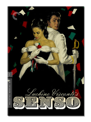
My initial task was to create a title treatment for Glenn Orbick's terrific cover illustration. I was brought into the project before the illustration was complete --though Sarah and Eric shared all the notes on direction and visual reference. Every now and again I have the opportunity to marry type with illustration. It's something I enjoy doing because I find it works a different muscle than dealing with photo imagery.
Senso takes place in Venice, during the late 19th Century, though the film's production design makes references all the way back to antiquity. It's a lavish sensibility and, as the opening scene establishes, an operatic one. Sarah directed my attention to the baroque and rococo elements of the film and that seemed an ideal direction for the title treatment and subsequent packaging design.
I pulled some 19th Century type specimen sheets of ornate letter-forms. Not only are they opulent and of the time but upon close inspection, clearly hand-drawn. It seemed like an suitable pairing for the cover painting. Everyone felt good about this direction and I composed the consensus choice; the one with the diamond shaped fill (ZEIST). You'll notice that the sample has neither an N or an O. Those I created for the finished title treatment.

The intermediary sketch for the painting was greyscale and I held off applying color until the painting was through. Though at this stage I knew the background would be black and the type would be reversed. A really nice side effect of this, and I expect anticipated by most of us, would be that the diamond pattern that was the type's fill, when reversed, would make shapes that related to the falling colored sheets of paper.
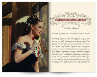
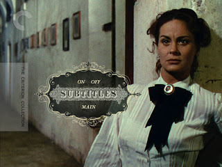
It wasn't practical to create an entire alphabet of the ornate typeface so for the DVD menus and booklet pages I used a face called Silverland. It afforded us the flexibility to set and revise titles and headings as needed —not to mention that it would be eminently more readable at smaller sizes. When combined with period ornaments and film imagery it let us establish a tone in keeping with Visconti's gorgeous film.
Here are a few spreads from the accompanying booklet as well as some DVD menus to give a sense of the package as whole. (Click to enlarge.)