
• The Criterion Collection


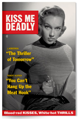
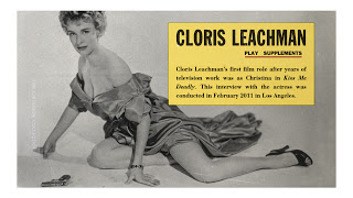
When The Criterion Collection asked me to design the packaging for the great Robert Aldrich noir, Kiss Me Deadly, they had a particular direction in mind. They wanted to present the lurid and sensational detective picture in the style of one of that era's counterparts, the lurid and sensational detective magazine. A natural combo. I was only too happy to oblige.A few days latter they sent a terrific volume featuring covers --and a few spreads too-- from Inside Detective Magazine, True Detective Magazine, True Police Detective Magazine, you name it. Almost all were from the mid 1950s.
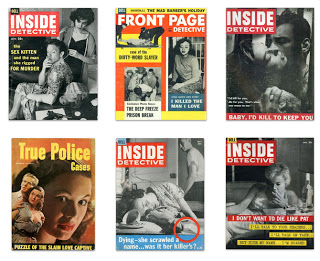
The best of them, I think, belongs to Dell's Inside Detective. Their covers were stark and immediate --often just two-color, though occasionally three. Their frequent use of the all-American Franklin Gothic presses just the right tabloid button. This was quality sleaze.
These are some my initial sketches which lead to the finished cover: (You can click through all the images in this post to enlarge.)

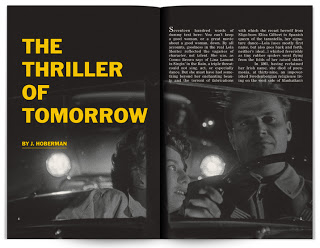
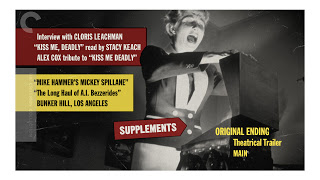
Here are samples of the twenty page booklet which accompanies the disc.
*


As well as some menu designs.
*


* Pardon the place-holder copy!
My sincere thanks to The Criterion Collection for making me a part of this one.
The Criterion Collection
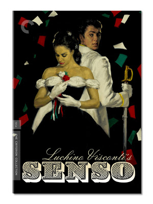
[Eric Skillman has a piece about the making of the cover for The Criterion Collection release of Lucino Vitconti's Senso on his site. He worked closely with Glenn Orbick, the cover illustrator. I coordinated with Art Director, Sarah Habibi on the package and menu designs. Since the cover always precedes the design of the package so you may want to read Eric's post before mine.]
My initial task was to create a title treatment for Glenn Orbick's terrific cover illustration. I was brought into the project before the illustration was complete --though Sarah and Eric shared all the notes on direction and visual reference. Every now and again I have the opportunity to marry type with illustration. It's something I enjoy doing because I find it works a different muscle than dealing with photo imagery.
Senso takes place in Venice, during the late 19th Century, though the film's production design makes references all the way back to antiquity. It's a lavish sensibility and, as the opening scene establishes, an operatic one. Sarah directed my attention to the baroque and rococo elements of the film and that seemed an ideal direction for the title treatment and subsequent packaging design.
I pulled some 19th Century type specimen sheets of ornate letter-forms. Not only are they opulent and of the time but upon close inspection, clearly hand-drawn. It seemed like an suitable pairing for the cover painting. Everyone felt good about this direction and I composed the consensus choice; the one with the diamond shaped fill (ZEIST). You'll notice that the sample has neither an N or an O. Those I created for the finished title treatment.

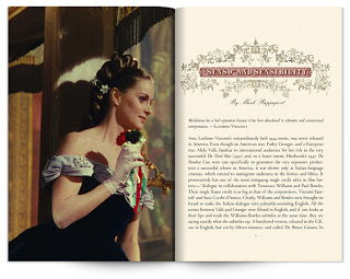
The intermediary sketch for the painting was greyscale and I held off applying color until the painting was through. Though at this stage I knew the background would be black and the type would be reversed. A really nice side effect of this, and I expect anticipated by most of us, would be that the diamond pattern that was the type's fill, when reversed, would make shapes that related to the falling colored sheets of paper.
It wasn't practical to create an entire alphabet of the ornate typeface so for the DVD menus and booklet pages I used a face called Silverland. It afforded us the flexibility to set and revise titles and headings as needed —not to mention that it would be eminently more readable at smaller sizes. When combined with period ornaments and film imagery it let us establish a tone in keeping with Visconti's gorgeous film.
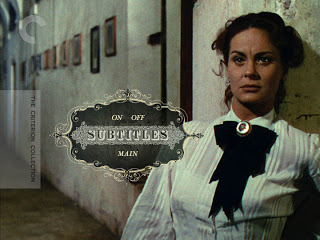
Here are a few spreads from the accompanying booklet as well as some DVD menus to give a sense of the package as whole. (Click to enlarge.)


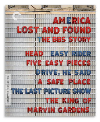 The Cover: I pitched two concepts, one of a battered American flag and the other of an old-style movie marquee. I thought the flag would prevail but Criterion really dug the run-down marquee. I'm glad they did. There's a lot of type on this cover and virtually all of it needed equal prominence. The marquee hit the right metaphoric note and it provided an organic solution to the problem of all those words.
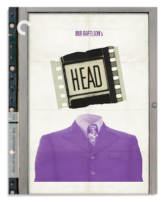 Head: Creating a pop confection that referenced the Monkees of TV didn't ring true to me. True, Head is a Monkees movie but it's hardly a movie version of the TV show and all that might imply. Head is something else and it seemed to me a Pop/Magritte collage could best convey that surreal else-ness. They say that Head has no opening titles. I suppose that's true but I wonder if you found the first reel and examined the leader you might discover differently?
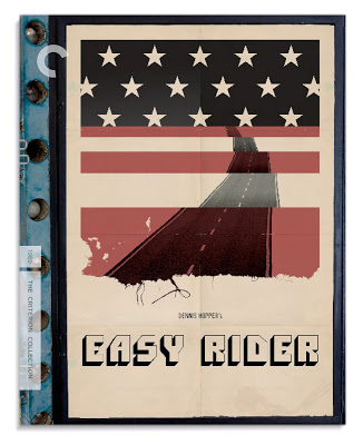 Easy Rider: I didn't work alone on this project, if not for the estimable talents of my colleagues Fred Davis and Peter Grant, making the deadline would have been impossible. I had about five days to do six covers. Not a great deal of time but I was feeling particularly inspired by the material. Ideas were coming fast. I was confident I could generate a cover a day --though not necessarily two. So on the Wednesday of that week, with two and a half covers done I called Mr. Davis. I showed him what I had made and asked him to contribute some Easy Rider concepts. He did. We had some back and forth and soon thereafter arrived at this piece of visual poetry.
 Five Easy Pieces: An idea that came fully formed in my head: lines of music fused with the classic method for counting to five (albeit turned on it's side). It seemed befitting of Jack Nicholson's character, Bobby Duprea: it's a little oblique, takes some figuring out and something about it feels self-negating. I was pleased to render a solution that referenced the piano prodigy/road picture aspect of the movie. For so long the primary image associated with this film has been Nicholson in a hard hat next to an oil well. Handsome sure, but how well did it really relate to the story?
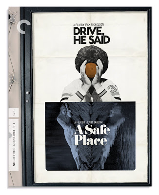 Drive, He Said / A Safe Place: It was learned some time into the process that there would be approval issues for any new image for Drive, He Said. There wasn't so much time for that so we went with an image which had been used during the film's general release. I played around with some Noah's ark imagery for A Safe Place but the universal reaction was that it read as too childish. Contemplating the Drive image, I was struck by the symmetry and that led me to the idea of turning the Tuesday Weld shot on it's side. Combined, the two have a Rorschach quality which may befit A Safe Place more so than Drive, He Said but since Drive is in the lead position I think on balance it works.
 The Last Picture Show: Another image that came fully formed in my head. The ticket corresponds to the film's title while the tear underscores the destruction of what was once whole --innocence perhaps? People like to keep tickets as souvenirs and in this sense the image too, speaks of memory and things from the past. Like the film, the cover is made in black and white.
 The King Of Marvin Gardens: My original version of this used the silver top hat, Monopoly token as the image within the title deed card. It seemed like an amusing metaphor for how the main characters saw themselves. Some at Criterion agreed and some didn't. Further, director Bob Rafelson wanted to see some Atlantic City imagery on the cover. So the hat was scrapped. I merged this shot of the two leads on horseback with another shot of the boardwalk as seen from the beach. In the end it worked out for the better. I'm very fond of the ticket image for The Last Picture Show and to have two covers in this set premised on objects-as-metaphors would have diminished the impact of each--especially when side-by-side in the collection.