Blithe Spirit

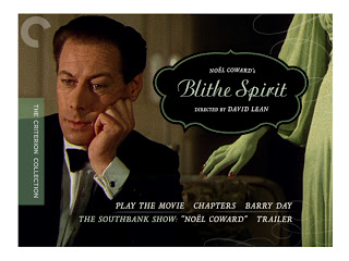
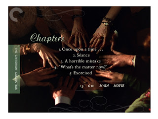
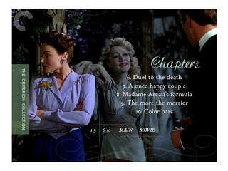
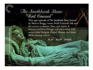
Some menu Designs for

Blithe Spirit

, the second film in the boxed set 

David Lean Directs Noël Coward.

I wanted to keep all the typefaces for the set distinctly British. Most of the faces I used were originally designed by either Eric Gill or John Baskerville. The script-face here is called Ariston and it comes out of the early 20th century vogue for 'royal' typefaces. I think it, along with the flourishes lend a certain aristocratic air to the proceedings while at the same time playfully insinuates the intrusion of a certain, feminine "other".

• David Lean Directs Noël Coward

In Which We Serve

David Lean Directs Noël Coward is a terrific new boxed set which The Criterion Collection is releasing March 27th. It contains Lean's first four films --all collaborations with Coward. I designed the package as well as menu designs for the DVDs. I'll have more to say in the following posts, including a process post on the packaging as well. To start, here are some of the DVD menu designs for the first of the four, In Which We Serve

.

• David Lean Directs Noël Coward

Children of Paradise

Poster for the Janus Films release of the restored Children of Paradise.

The beautiful painting was created by production designer Alexandre Trauner for the 1945 film. I got a peek at several of the production design paintings while working on this and they're all pretty sprecial.

For the poster, art director Sarah Habibi invited me to compose a title treatment based on the main title card, translating the original, les Enfants du Paradis. The title sequence is a gorgeous mix of French scripts and display faces --all hand lettered, naturally. This solution would be no quick trip to the font library. All of my letters are custom drawn too.

The spectacularly restored film is making it's tour of the U.S. this spring. For more information on Children of Paradise, the touring schedule --as well as a video demonstration of the painstaking restoration proces-- be sure visit the Janus Films website.

• Janus Films

Representing Vanya


Louis Malle's Vanya On 42nd Street is, at it's heart, a performance of Anton Chekov's Uncle Vanya. By some estimations one of the best captured on film. That isn't what the film is about though --well, not entirely. It's also a representation of a time in the early 1990's when André Gregory had been rehearsing and performing Uncle Vanya as a form of underground theater --squatting in decrepit Broadway playhouses for invitation-only audiences. 

Criterion had some beautiful production photographs by Brigitte Lacombe they wanted to see as covers. I was asked to see what I could make with them, using the photos as either a collage or as single images. They also were up for my take on the cover without the photos if I had one.

The film's jazzy opening down 42nd Street inspired the subway type cover. The movie begins with hit of New York and it seemed appropriate to incorporate that apsect into the cover. The script page in the background is from Uncle Vanya:  the opening lines that are spoken as the film transitions from the world of New York to the world of the play.

I made several collage covers but the cast photo by itself worked best for the story Criterion wanted to tell for the release --of how these individuals came together to create this theater experience. 

That said, there was some concern about the black and white imagery. It's a beautiful and commanding photo but might someone assume Vanya On 42nd Street is a black and white film? I explored type solutions looking for ways to use color that might lead audiences to expect a color film but Criterion felt that a full color option was also needed. Just to be sure.

There's a curtain call at the close of the film around the same table that appears in the Lacombe shot. I put together some covers using it. Frame grabs don't have the same quality as a still photograph but it was as close to a color version of the photo that was available. In the end Criterion decided to stick with the black and white. 

Dispite intitial misgivings, the subway type cover was still in play and being discussed. Criterion liked the script page background. Could it be incorporated with the photograph? Superimposing all those words wasn't working for me. Something naturalistic seemed more appropriate for this occasion. So I chose a photo-as-object solution --paper-clipping the photo directly to the script page. That was a choice which clicked with Criterion and so the cover was chosen.